
Tips & How-To
Gallery Wall Layouts That Leave Room for Shelf Decor
Sep
TL;DR
Adding shelves to a gallery wall gives it depth and lets you swap decor without patching nail holes.
- Measure your wall, keep the grouping to about two thirds the width of the furniture below, and tape up paper templates before drilling.
- Pick a layout that fits the space: an anchored grid with one shelf underneath, an offset column for narrow walls, or a split layout above a desk.
- Leave ten to twelve inches of clearance above each shelf, and keep frame gaps closer to two inches so the group reads as one piece.
Why Shelves Belong in a Gallery Wall
Among gallery wall layouts, one with shelves does something a flat arrangement of frames can’t. It adds depth. Your eye moves in and out, not just side to side.
Frames hold one plane. Shelves hold objects that catch light and cast shadows. That small bit of dimension makes a wall feel lived in rather than staged.
Those open shelves you've planned deserve something worth looking at, so browse our handcrafted sculptures and small decor pieces at lcdesigns.cc.
Learn more →Shelves also give you room to change your mind. Swapping a framed print means pulling nails. Swapping a small sculpture takes two seconds.
That flexibility matters more than people expect. Seasons change. Moods change. A wall that can shift with you stays interesting for years.
So the question isn’t whether to include shelves. It’s which of the many gallery wall layouts puts them somewhere that still reads as one piece.
Plan the Wall Before You Pick Up a Hammer
Measure the wall first. Write down the width and height. Then decide how much of that space you actually want to fill.
A common mistake is spreading art too wide. The arrangement should feel anchored to something, usually a sofa, a bed, or a console table below it.
As a rough guide, keep the overall grouping to about two thirds the width of the furniture beneath. Anything wider starts to float.
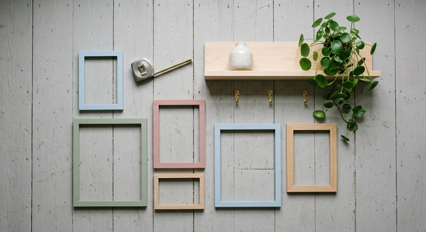
Cut paper templates for every frame and shelf. Tape them up. Live with them for a day or two before you commit. Testing gallery wall layouts on paper costs nothing and saves you patching holes later.
- Note the height of your ceiling and any trim or moulding
- Mark where studs sit, since shelves need real support
- Check where light falls at different times of day
- Decide on a centre line and stick to it
- Leave two to three inches between pieces for breathing room
Layouts That Make Space for Shelf Decor
The simplest of the gallery wall layouts is the anchored grid. Frames form a neat block, and a single shelf runs beneath the whole thing. Clean, quiet, easy to get right.
The offset column works well in narrow spots. Stack frames on one side and put shelves on the other. The asymmetry feels deliberate rather than accidental.
Then there’s the salon style wall, one of the looser gallery wall layouts, where frames cluster around a central piece. Tuck one or two short shelves into the outer edges of the cluster.
A floating shelf ladder is another option. Three shelves stacked vertically, with frames filling the wall on either side. It draws the eye upward.
For a gallery wall with shelves above a desk or sideboard, try the split layout. Art on top, shelf below, with a clear horizontal band between them.
Getting the Spacing Right
Shelves need more clearance than frames. Objects sit on them, so you need vertical room above each one.
Plan for at least ten to twelve inches of empty space above a shelf. Less than that and anything taller than a coaster looks cramped.
If you’re stacking shelves, keep the gaps even. Uneven spacing reads as a mistake even when it was intentional.
Horizontal spacing between frames can be tighter. Two inches is usually plenty. The tighter the gap, the more the group reads as one object.
Hang the centre of the whole arrangement at roughly eye level, around fifty seven inches from the floor. Shelves can sit above or below that line.
Styling the Shelves Without Crowding Them
The hardest part of a gallery wall with shelves isn’t the hanging. It’s resisting the urge to fill every inch of shelf space.
Negative space is part of the design. A shelf that’s two thirds full looks curated. A shelf that’s completely full looks like storage.
Vary the heights of what you place. A taller object, a medium one, and something low and flat makes a pleasing triangle.
Group in odd numbers. Three items on a shelf almost always looks better than four. Two works if they’re clearly different in scale.
- Small sculptures or figurines for height and character
- A short stack of books laid flat as a riser
- A ceramic piece or two for texture
- Something living, like a small trailing plant
- One empty stretch of shelf, on purpose
Keeping the Whole Wall Feeling Like One Idea
Cohesion comes from repetition. Repeat a colour, a material, or a frame finish across the arrangement. The eye links them together.
You don’t need everything to match. Mixed frame styles can work beautifully if the tones stay in the same family.
Let the shelf objects echo the art. If your prints lean botanical, a few plant forms on the shelf tie it all in.
Step back often while you work. Walk to the far side of the room. Problems that are invisible up close jump out from ten feet away.
Photograph the wall on your phone. A flat image strips away depth and shows imbalance you’d otherwise miss. It’s also the fastest way to compare two gallery wall layouts side by side.
Gallery wall layouts that mix frames and shelves reward patience more than perfection. Give it time, adjust as you go, and it will settle into something that feels like yours.
→Handmade Holiday Gifts for People Who Have Everything→Housewarming Gift Ideas That Suit a Place You Haven't Seen
Frequently Asked Questions
How much space should I leave above a shelf on a gallery wall?
Plan for at least ten to twelve inches of empty space above each shelf. Anything less and taller objects look cramped, though something low like a ceramic coaster on a stand still works. If you're stacking multiple shelves, keep the gaps even, since uneven spacing reads as a mistake.
What layout works best if I want both frames and shelves?
The anchored grid is the easiest to get right: frames form a neat block with a single shelf running beneath the whole thing. For narrow walls, try the offset column, with frames stacked on one side and shelves on the other. Over a desk or sideboard, a split layout puts art on top and a shelf below with a clear horizontal band between them.
How wide should my gallery wall be compared to the furniture below it?
As a rough guide, keep the overall grouping to about two thirds the width of the sofa, bed or console table beneath it. Anything wider starts to float and loses its anchor. Cut paper templates for every frame and shelf, tape them up, and live with the arrangement for a day or two before you commit.
What height should I hang the centre of a gallery wall?
Hang the centre of the whole arrangement at roughly eye level, around fifty seven inches from the floor. Shelves can sit above or below that line as long as you pick a centre line and stick to it. Also note your ceiling height and any trim or moulding before you start marking the wall.
What kind of pieces from LC Designs suit a decor shelf?
Our handcrafted sculptures and statues work well on shelves, and the range covers animals, people, birds, flowers and plants, sea life and abstract forms. Ceramic coasters and small toys can also fill the smaller gaps between taller pieces. Everything is made in our studio, so what you see listed is what ships.
How much spacing should I leave between frames?
Two inches is usually plenty between frames, and two to three inches is a good general rule for breathing room across the whole arrangement. The tighter the gap, the more the group reads as one object rather than scattered pieces. Shelves are the exception, since they need more vertical clearance than frames do.

